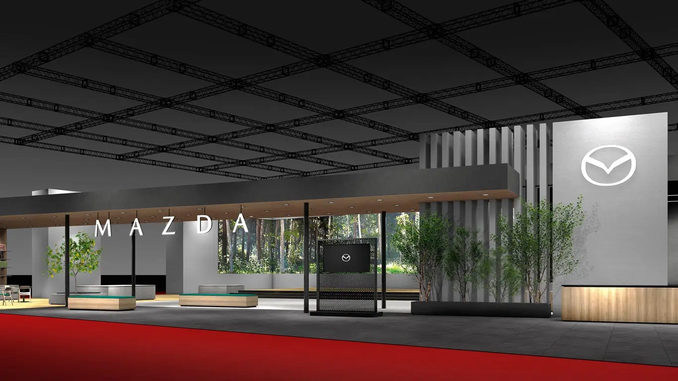

Mazda has unveiled a refreshed take on its signature emblem, carefully preserving the spirit of the 1997 original. The centerpiece remains the letter M, shaped as a pair of graceful, stylized wings that speak to freedom of movement and a drive toward the future.
The new mark stands out for its refinement and crisp execution. It has been reworked to enhance legibility and recognition across today’s digital landscape, delivering clean, consistent rendering on screens of all kinds. Alongside the emblem, the company introduced an updated typeface that supports a fresher, more contemporary look for the brand.
The logo is already live on Mazda’s official website and will be rolled out across the company’s communications and products over time. The move is designed to strengthen the brand’s visual identity and boost recognition among customers, while reiterating Mazda’s core promise: the joy of driving. It’s a thoughtful evolution rather than a reset—familiar enough to keep loyalists onboard, yet polished to meet modern expectations.