
Honda has unveiled a redesigned H emblem that will represent the company’s automotive business in the era of electric mobility. The update ties into a broader brand transformation and a pivot toward new types of powertrains.
Key change
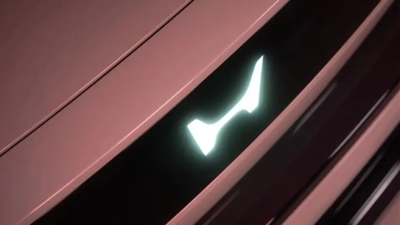
The badge that has stood since 1963 has seen only minor tweaks over the years. This latest version is the most substantial refresh in decades, as reported by SPEEDME.RU. Developed alongside next-generation electric models, including the upcoming Honda 0 lineup, the emblem is meant to signal forward motion and readiness for new challenges. Given the industry’s rapid shift, the timing of the redesign feels anything but accidental.
Design and rollout
The new mark resembles two outstretched hands—a visual that conveys openness, customer focus, and an ambition to broaden mobility. That symbolism aligns with Honda’s move to cleaner powertrains, the expansion of its HEV range, and work on a next-generation EV platform. The emblem will begin appearing on vehicles from 2027 and will also feature across dealer identities, brand communications, and motorsport programs. The hand-like motif reads as an effort to humanize the tech transition, a subtle cue that could resonate as lineups become increasingly electric.
Why it matters
Refreshing the corporate badge is a strategic signal of deep modernization. It gives Honda room to recalibrate its positioning as electrification reshapes the market. Beyond aesthetics, a clear visual anchor can help underscore the technological shift and reinforce brand recognition in the new‑energy vehicle space.
The new Honda logo marks the start of a fresh chapter, underscoring the company’s push toward an electric future. Set to define the identity of next-generation models, the emblem frames a new era aimed at innovation and broader mobility—provided the product roadmap keeps pace, the symbol should carry substance, not just style.